Table of Contents
ToggleYour pantry might spend most of its time behind a closed door, but that doesn’t mean it should be ignored when it comes to color choices. A well-chosen pantry color can transform how the space feels, and functions, every time you swing open that door. Whether you’re planning a small reach-in pantry or a spacious walk-in closet, the right palette makes the space feel more intentional, organized, and inviting. This guide walks you through practical pantry color ideas that work for different lighting conditions, storage styles, and personal tastes, so you can pick a scheme that actually matches your kitchen vibe and lifestyle.
Key Takeaways
- Warm neutral pantry color ideas like cream, taupe, and greige create a cozy, forgiving foundation that works with virtually any kitchen style while reflecting light to brighten darker spaces.
- Cool tones such as soft blues and pale greens offer a modern, serene aesthetic that makes cramped pantries feel more spacious while maintaining a calming backdrop for stored goods.
- Bold pantry colors like deep navy, charcoal, and jewel tones create dramatic, high-end effects but require supplemental lighting and careful sample testing to avoid a dim, dated appearance.
- Proper lighting is essential for all pantry color choices—dark colors need under-shelf or LED strip lights, while warm neutrals require decent illumination to prevent looking dull and institutional.
- Test paint samples on your actual pantry walls for several days under your existing lighting conditions before committing to a color, since room-specific factors dramatically affect how colors appear.
Warm Neutrals: Creating A Cozy Foundation
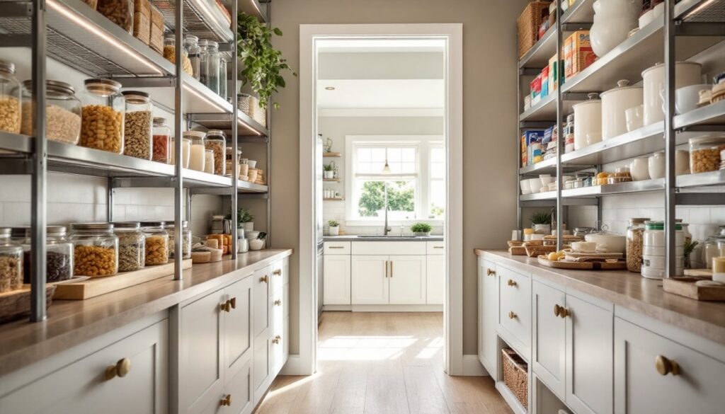
Warm neutral tones, cream, soft taupe, warm gray, and light greige, form the backbone of most successful pantries because they’re forgiving and work with virtually any kitchen style. These colors reflect light well, which is crucial in pantries that often lack substantial natural light or overhead fixtures.
Cream and off-white shades are the safe default, but they can feel bland if your pantry is already small or windowless. The trick is choosing a warm white with undertones (look for labels mentioning “warm white,” “ivory,” or “cream”) rather than pure white, which can read as institutional. Benjamin Moore’s HC-172 Newburyport Cream or Sherwin-Williams SW 7015 Repose Gray give you that cozy-but-clean aesthetic without looking sterile.
Warm grays and greiges (a gray-beige hybrid) offer slightly more personality while staying neutral. These shades work beautifully with stainless steel shelving, wire racks, or natural wood cabinetry. If your pantry has existing wood tones, say, oak trim or wooden shelves, a greige creates visual continuity without the monotony of matching everything exactly. Pantries painted in greige tend to feel more mature and intentional than plain white, and they age well without showing dust or minor marks as readily.
One practical note: warm neutrals work best in pantries with decent lighting. If your pantry is windowless with only a single bare bulb, consider pairing the neutral wall color with bright under-shelf lighting or installing a motion-sensor light. The color will look dull without proper illumination, defeating the whole purpose of creating a welcoming space.
Cool Tones: Modern And Serene Pantry Spaces
Cool grays, soft blues, and pale greens have become popular in contemporary kitchens, and they translate well to pantry spaces if you approach them thoughtfully. These colors feel modern and can make a cramped pantry feel slightly more spacious by receding visually.
Soft, muted blues, think spa-like rather than coastal, work particularly well in pantries because they’re calming and don’t compete with your actual stored goods. A pale blue like Farrow & Ball’s Parting Pencil or Benjamin Moore HC-159 Breath of Fresh Air keeps things light while adding subtle character. The key is staying with the softer end of the blue spectrum: avoid bright or saturated blues, which can feel overwhelming in a confined space and make shelves of colorful cans and boxes look chaotic.
Cool grays are equally versatile and pair beautifully with modern shelving systems, glass containers, and minimalist organizational tools. Pantries styled with kitchen organization inspiration often feature cool gray walls because the color creates a clean, curated backdrop. This works especially well if you’re using clear storage containers or glass jars, which show their contents against a neutral but slightly cooler background.
Pale greens offer a gentler alternative to blues while maintaining that cool, serene quality. Sherwin-Williams SW 6205 Softened Green or similar pale sage tones feel fresh without being trendy, and they pair naturally with wood shelving, vintage finds, and farmhouse-style containers. The psychological effect is real too, soft greens have a naturally calming quality that makes food prep feel less rushed.
Bold And Dark Colors: Making A Statement
If you’re willing to commit to a stronger look, darker and bolder pantry colors can create a dramatic, high-end feel that completely changes how the space functions visually. The catch: dark colors require good lighting and a willingness to accept that every smudge and dust particle becomes visible.
Deep Navy And Charcoal Options
Deep navy and charcoal create sophisticated, gallery-like backdrops that make stored items pop visually. Navy especially has experienced a major resurgence in kitchen design, and it works beautifully as a pantry color because it grounds the space and makes open shelving or glass-front cabinets feel intentional rather than cluttered.
When painting a pantry navy or charcoal, prepare for the fact that you’ll need at least two coats of quality paint, and possibly a primer, especially if you’re covering light colors. Darker paints often require a bonding primer (look for products labeled “stain-blocking” or “multi-surface primer”) to achieve even coverage and prevent bleed-through from old wall color. Benjamin Moore HC-154 Hale Navy and Farrow & Ball’s Railings are pantry classics because they’re deep but not black, giving you the drama without the cave-like feeling.
Charcoal is similarly dramatic but feels more modern and less traditional than navy. It pairs well with stainless steel, sleek hardware, and contemporary shelving. The important caveat: charcoal and navy both need supplemental lighting. A single overhead fixture won’t cut it, add battery-operated puck lights under shelves, or install a small LED light strip along the top of shelving units. Without proper illumination, your dramatic pantry becomes a dim closet.
Rich Jewel Tones For Personality
Deep jewel tones, emerald, sapphire, burgundy, and forest green, are trending in high-end pantry designs featured on home design inspiration platforms. These colors demand confidence, but they create an unmistakably curated, luxury feel if executed properly.
Emerald green is perhaps the most accessible jewel tone for a pantry: it feels sophisticated without being as heavy as burgundy, and it photographs beautifully, making it popular with renovation enthusiasts. Pair it with brass hardware, warm wood shelving, and vintage-style storage containers for a cohesive look. Like darker neutrals, emerald requires good lighting and a primer coat before painting.
Burgundy and deep aubergine feel richer and more intimate, working especially well in larger walk-in pantries where the enclosed space doesn’t feel claustrophobic. These colors require the most careful lighting design, without sufficient brightness, they’ll read as dark and dated rather than elegant. Sherwin-Williams SW 6307 Fine Wine is a tested burgundy for pantry applications.
Before committing to a jewel tone, test it with sample pots on your specific pantry walls. Lighting conditions vary significantly by room, window placement, and time of day. What looks stunning in a bright showroom may feel oppressive in your windowless kitchen nook. Apply generous samples and live with them for at least a few days, checking them at different times and under your actual pantry lighting.
Conclusion
Choosing a pantry color is fundamentally about balance: create a space that’s functional, well-lit, and visually coherent with your kitchen, while honoring your personal taste. Whether you gravitate toward warm neutrals for their forgiving nature, cool tones for a modern edge, or bold colors for unmistakable personality, the best choice is one you’ll be happy opening your pantry door to every single day. Take time to sample paints, assess your existing lighting, and consider how your stored items will look against your chosen color. A little upfront thoughtfulness transforms a purely utilitarian space into one that feels genuinely intentional, and that’s where good design begins.